 New link in the top of page "IRC Chat". |
| Register | Login | |||||
|
Main
| Memberlist
| Active users
| Calendar
| Last Posts
| IRC Chat
| Online users Ranks | FAQ | XPW | Stats | Color Chart | Photo album |
|
| | |||
 New link in the top of page "IRC Chat". |
| Register | Login | |||||
|
Main
| Memberlist
| Active users
| Calendar
| Last Posts
| IRC Chat
| Online users Ranks | FAQ | XPW | Stats | Color Chart | Photo album |
|
| | |||
| 0 users currently in Muses' Sanctuary. |
| User | Post |
| insectduel Posts: 601/684 |
I want to see some fangames on Hatsune Miku.
Besides M.U.G.E.N Maybe the Vocaloid warrior. |
| Cteno Posts: 1037/3417 |
Originally posted by True Flight Me wants! 
Originally posted by Katana I only colored this one, this one was in photoshop with a mouse. The lineart was done by some guy from Deviantart, from whom I was given permission to use. Honestly, with the boob, it's mostly my fault that it's not visible as I forgot to shade right there and photoshop was acting up when I tried to fix it so I never did. It's one of the main reasons why I started using PainttoolSAI, it just seems to work better for what I do. (also, attempting lineart in PS just didn't feel right.) As far as critiquing goes, lay it on me! I'm glad to actually receive some! -edit Okay, I remembered why I never changed anything on this... I forgot to save it as a .psd  |
| True Flight Posts: 3938/5245 |

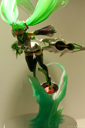
Miku VN 02 Mix |
| Katana Posts: 2784/3649 |
Right, maybe I should look up who this chick is before commenting, or perhaps, if you've used a source image, I could see that?
The piece looks good. I've been a fan of your coloring since I've seen your work here. I do recall asking what you did it in and perhaps it was you, but you did it in something other than photoshop, and I was utterly impressed. Quite frankly, I am too lazy to look at your old Miku threads to double check on that. So in short, the work is good. However, you said something seemed a bit off to you, so I purposely looked for a problem. Art school has turned me into quite the snob, says my "non-art school friends" as they call themselves...but in reality, I just understand how frustrating it is when people don't take enough care to look at my work for more tan two seconds. So, tell me if I am insulting, and I won't do this to you again, but I'm going to point out the "bad" I don't particularly like how skinny she is at the top, and how you can only see one boob. I understand about angle and stuff, but the right side (my right as I'm looking at it) seems a bit flat. HOWEVER, there poses another conundrum. Okay, so you add a little more curvature on the right side...now what? Well, now they look TOO close together...hence why the top seems a bit thin to me. I dunno...I could probably be of more assistance if I saw the actual source, whether you just borrowed, or drew exactly what you saw....because I've seen "professional" work that looks like that, and maybe it's the style of the character in itself and I'm failing to see it.  HELL I need to learn to talk less. But, I like what I see, therefore put more interest in expressing what I see in the work. HELL I need to learn to talk less. But, I like what I see, therefore put more interest in expressing what I see in the work.
Cheers. |
| True Flight Posts: 3937/5245 |
More Miku VN02 MX!!! |
| Cteno Posts: 1035/3417 |
Originally posted by True Flight Lies and slander! D: |
| True Flight Posts: 3936/5245 |
Too much Mikuuuu |
| Cteno Posts: 833/3417 |
Originally posted by Junpei Jones Hey, wait just one darned minute there... I agree. |
| 天国JOE Posts: 2541/2999 |
Needs more Kaito. |
| Cteno Posts: 832/3417 |
Originally posted by One Shot One Kill Blasphemer! There can never be enough Miku! |
| True Flight Posts: 3854/5245 |
too much mikuuuuu |
| Cteno Posts: 831/3417 |
Here's the lineart.
 |
| 天国JOE Posts: 2536/2999 |
Did you draw it too, or just color? I'd like to see the original!
Either way, good job colorin'! |
| Cteno Posts: 829/3417 |
Took me about 6 hours to color. I feel like I'm getting better, but it seems something is amiss with this one... I can't put my finger on it!
 |
